Shortlist
Award
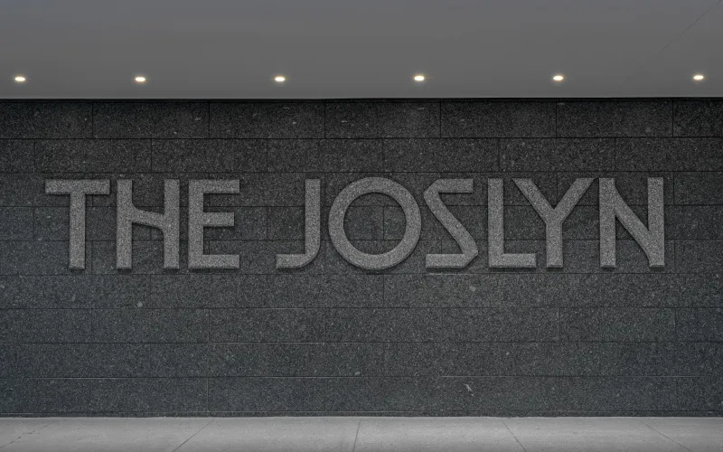
Custom Typography for a Museum in Omaha
Joslyn Art Museum
United States
2025
Share:


To see entry media,
create an account
or
log in.
Logging in grants access to Advanced Search
and more Entry Details.


Entrant Company
Pentagram Design
Entry Type
Public Service
Program
Clio Awards 2025
Medium Type
Professional
Medium
Design Craft
Category
Typography
Nodding to the past, present and future, The Joslyn typefaces encompass several different variations inspired by the structures and collections that comprise the revitalized Museum. These can be used on their own or combined with each other to form a distinct graphic language.
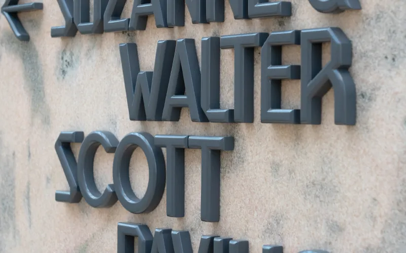
The letterforms of the variations have qualities that reflect the architecture of each of the 3 buildings at The Joslyn: sharp and angular for the original 1931 building by John and Alan McDonald, with flares that evoke the hand-drawn Art Deco lettering of its entrance inscription; rectilinear for the 1994 Scott Pavilion; and both rectilinear and curving for the new Hawks Pavilion.
The Pentagram designers developed a full alphabet for each of the fonts. The letterforms vary in their angled cuts and crossbars, slight flares and sharp corners. The design can be further modified along a chronological continuum from historical to contemporary, with characteristics like serifs and flares adjusted accordingly.
This flexibility allows the typefaces to grow along with the Museum and its community. The typefaces encompass an alphabet of glyphs and phonetic characters for Umóⁿhoⁿ (Omaha) and related Indigenous languages spoken in this region.
The new typefaces are utilized in signage and wayfinding throughout the museum, in exhibition graphics, in promotional campaigns and on The Joslyn website and social media channels.
Credits
To see entry credits,
create an account
or
log in.
Logging in grants access to Advanced Search and more Entry Details.
Duplicate statues available now
Buy a Statue in
Design Craft
to Celebrate Your Team
Related Winners

Entrant Company
Klick Health
Medium Type
Professional
Medium
Film Craft
Category
Cinematography
Entrant Company
Klick Health
Medium Type
Professional
Medium
Branded Entertainment & Content
Category
Partnerships/Co-Creation

Entrant Company
The Walt Disney Company
Medium Type
Professional
Medium
Film
Category
30 Seconds and Under
Awards
by Christine Champagne
by Christine Champagne
Awards
by Christine Champagne
by Christine Champagne