

Shortlist
Award
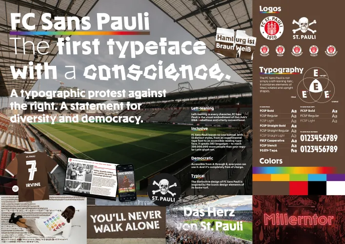
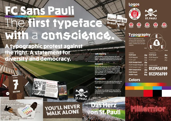
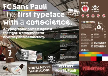
FC Sans Pauli – The first typeface with a conscience.
Fußball-Club St. Pauli von 1910 e.V.
Germany
2026
Share:


To see entry media,
create an account
or
log in.
Logging in grants access to Advanced Search
and more Entry Details.

Entrant Company
Karl Anders – Contemporary Branding
Entry Type
Teams, Leagues, Governing Bodies, & Associations
Launch Country
Germany
Program
Clio Sports 2026
Medium Type
Professional
Medium
Design
Category
Brand Identity
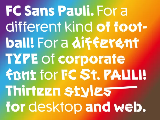
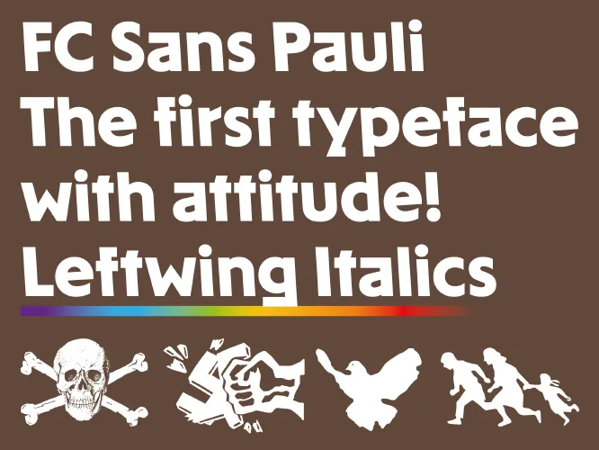
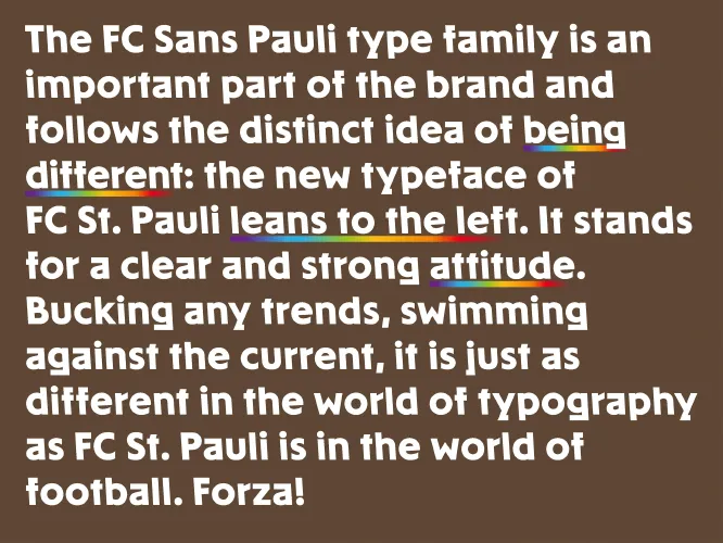
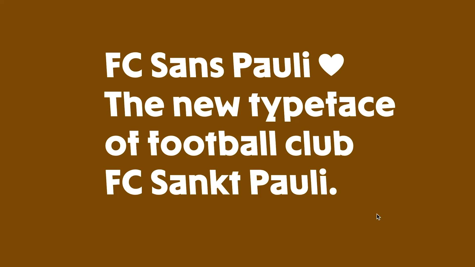
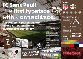
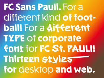
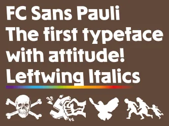
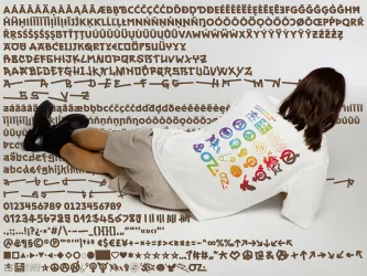
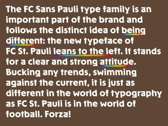
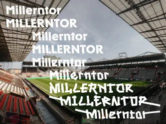
Left-leaning in every character, FC Sans Pauli isn’t just a rebellious and utterly unconventional font but also the visual embodiment of the club’s DNA – inspired by the iconic design elements of its home turf.
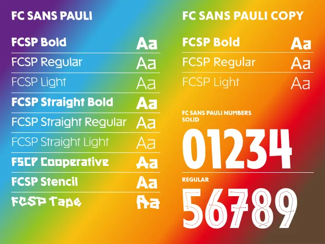
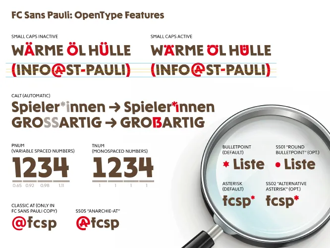
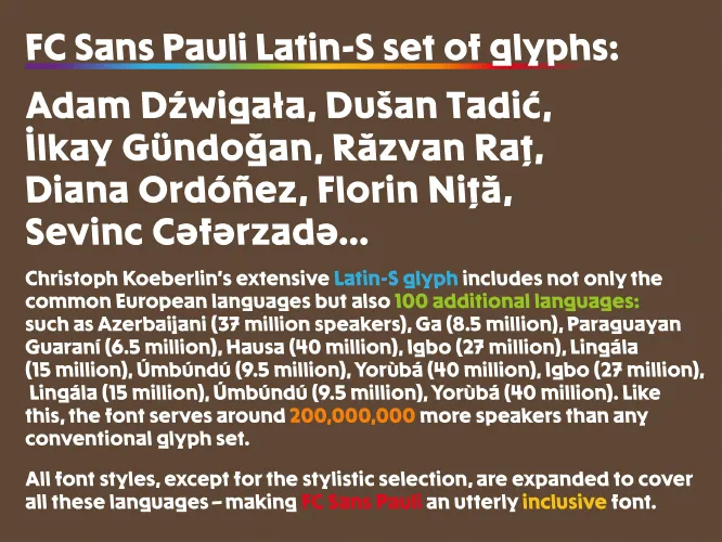
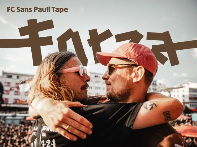
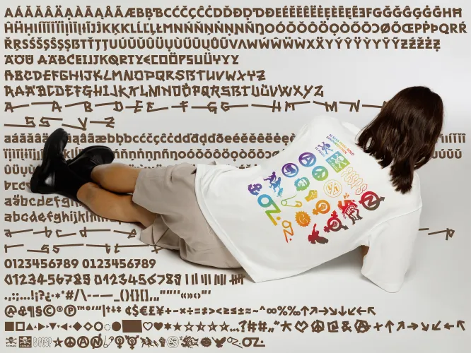
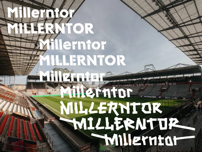
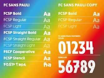
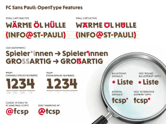
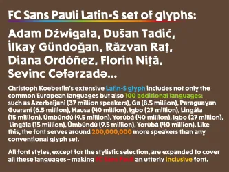
What’s more, FC Sans Pauli is typographic genius down to the last glyph. It consists of 13 distinct styles, from an experimental tape font to an accessible reading typeface. It transcends borders and speaks 383 languages. Accessible from A to Z, everyone can use it. And it’s completely free. It’s a font that leaves no one behind.
Credits
To see entry credits,
create an account
or
log in.
Logging in grants access to Advanced Search and more Entry Details.
Duplicate statues available now
Buy a Statue in
Design
to Celebrate Your Team

Related Winners


Shortlist
Clio Sports
Mastercard x MLSE
Canada
2026
Entrant Company
Maple Leaf Sports & Entertainment
Medium Type
Professional
Medium
Integrated
Launch Country
Canada
Shortlist
Clio Sports
Mastercard x MLSE
Canada
2026
Entrant Company
Maple Leaf Sports & Entertainment
Medium Type
Professional
Medium
Gameday Fan Experience
Category
Pre-Game
Launch Country
Canada
Entrant Company
Wieden+Kennedy SP
Medium Type
Professional
Medium
Sports Betting
Category
Film
Launch Country
Argentina

Super Bowl
by Christine Champagne
by Christine Champagne
Behind the Scenes
by Christine Champagne
by Christine Champagne
Musings
by Dalia Burde
by Dalia Burde

Sports
by Shahnaz Mahmud
by Shahnaz Mahmud