

Shortlist
Award
A More Intuitive ŌURA App
ŌURA
United States
2026
Share:



To see entry media,
create an account
or
log in.
Logging in grants access to Advanced Search
and more Entry Details.

Entrant Company
Instrument
Entry Type
Products & Devices
Launch Country
United States
Program
Clio Health 2026
Program
Traditional Mediums
Advertiser Category
Lifestyle, Wellness & Over-the-Counter
Medium
Digital / Mobile & Social Media Craft
Category
User Interface (UI)
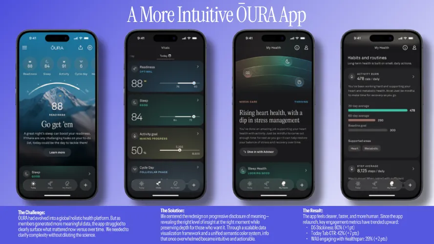
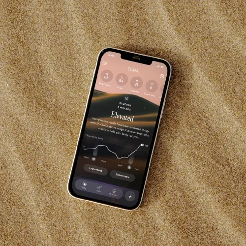
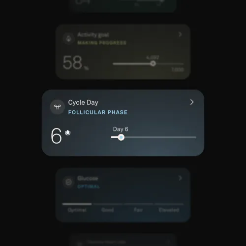
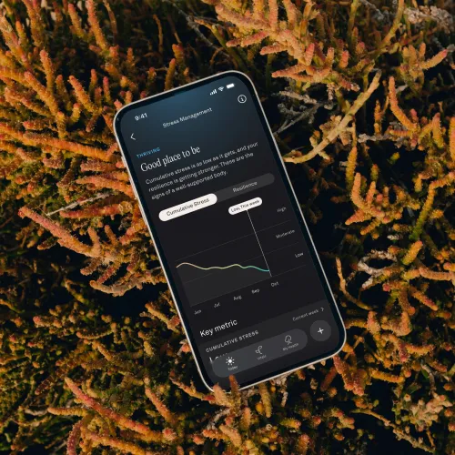
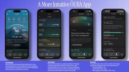
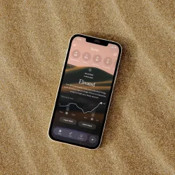
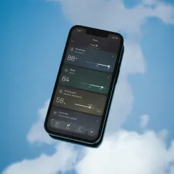
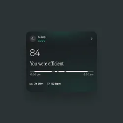
We designed the new ŌURA app around how people actually move through their day, prioritizing clarity, relevance, and ease. Grounded in rigorous user research and usability testing, the experience aligns health insights with real-world moments, helping members make better decisions with less effort.
Designing for daily rhythms
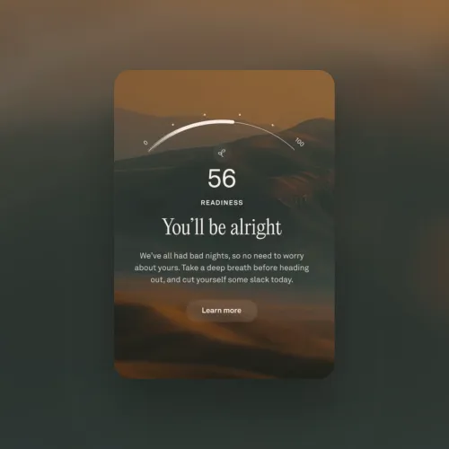
The experience centers on contextual prioritization rather than information volume. The Today tab establishes a clear starting point each morning, surfacing readiness, sleep quality, and the day’s primary focus so members can quickly understand where they stand.accordingly.
As the day unfolds, the same surface adapts. Guidance shifts from morning orientation to daytime encouragement and in-the-moment support, then transitions in the evening toward rest and recovery. Members don’t need to navigate or filter; the experience evolves with them automatically.
Simplicity through relevance
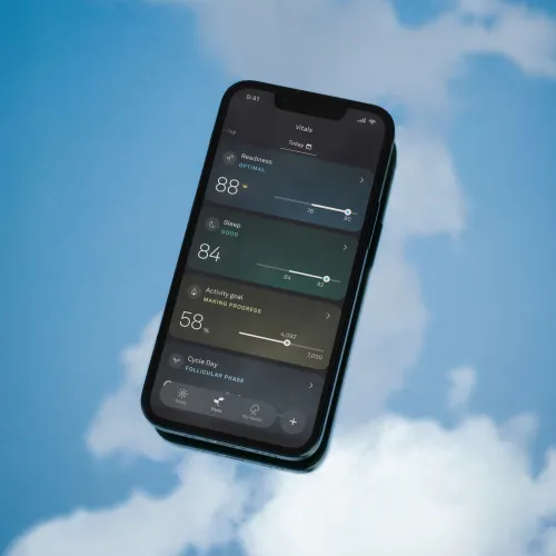
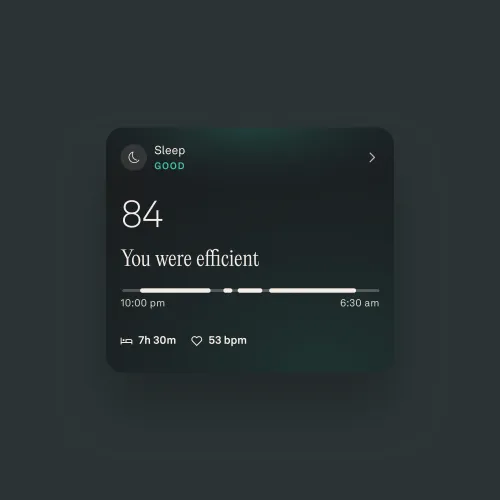
A clear visual and informational hierarchy ensures that what matters most is always foregrounded. By prioritizing relevance over completeness, the app reduces cognitive load and decision fatigue, allowing members to engage quickly without sorting through dense health data.
Progressive disclosure
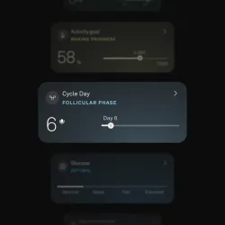
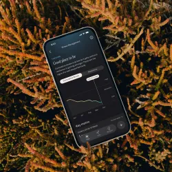
Complexity is managed through progressive disclosure. Surface-level views offer immediate, digestible insight for quick check-ins. With a tab, members can move into deeper, more detailed views when needed.
Visual systems
A unified, adaptive color system reflects each member’s personalized baseline and current state, signaling what’s optimal, what needs attention, and what falls outside the norm. Paired with a restrained visual language of rings, bars, and trend lines, the system enables instant comprehension while maintaining visual calm and consistency.
Impact
Simplicity is achieved through intentional information architecture, contextual prioritization, and progressive disclosure. By aligning insight delivery with daily rhythms and revealing deeper details only when it adds value, the experience remains easy to use, efficient, and supportive throughout the day.
Effectiveness comes not from feature volume, but from thoughtful prioritization and alignment with daily rhythms. The result is a system that feels calm, responsive, and trustworthy, empowering better health decisions with less effort.
Since the app relaunch, engagement metrics have increased:
D5 Stickiness: 80% (+1 pt)
Today Tab CTR: 42% (+7 pts)
WAU engaging with Healthspan: 29% (+2 pts)
Credits
To see entry credits,
create an account
or
log in.
Logging in grants access to Advanced Search and more Entry Details.
Duplicate statues available now
Buy a Statue in
Digital / Mobile & Social Media Craft
to Celebrate Your Team

Related Winners

Entrant Company
Langland
Traditional Mediums
Advertiser Category
Health Awareness & Advocacy
Medium
Creative Use of Media
Launch Country
United Kingdom

Entrant Company
dongseo university
Advertiser Category
Student
Category
Innovation
Launch Country
South Korea
Shortlist
Clio Health
NABA, Nuova Accademia di Belle Arti
Italy
2026
Entrant Company
NABA, Nuova Accademia di Belle Arti
Advertiser Category
Student
Category
Health Equity
Launch Country
Italy

Health and Wellness
by David Gianatasio
by David Gianatasio

Health and Wellness
by David Gianatasio
by David Gianatasio

Environment
by David Gianatasio
by David Gianatasio

2 Minutes With
by Shahnaz Mahmud
by Shahnaz Mahmud