Shortlist
Award
KitKat Phone Break
Nestlé
Czechia
2026
Share:


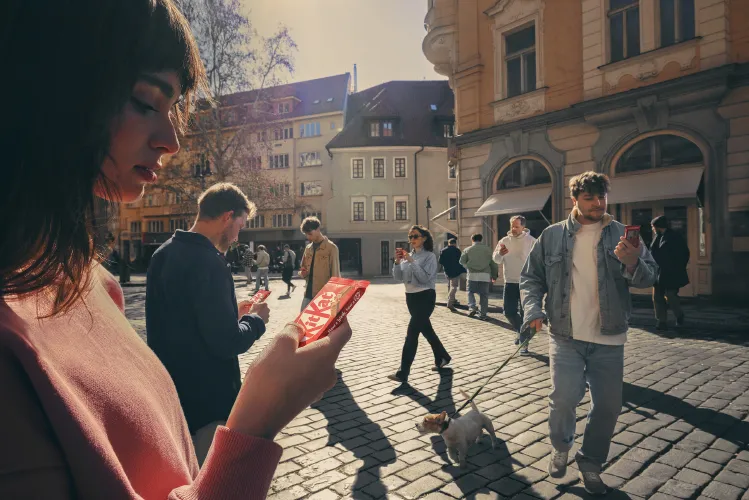
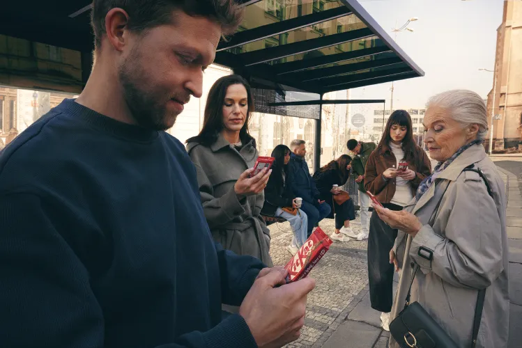
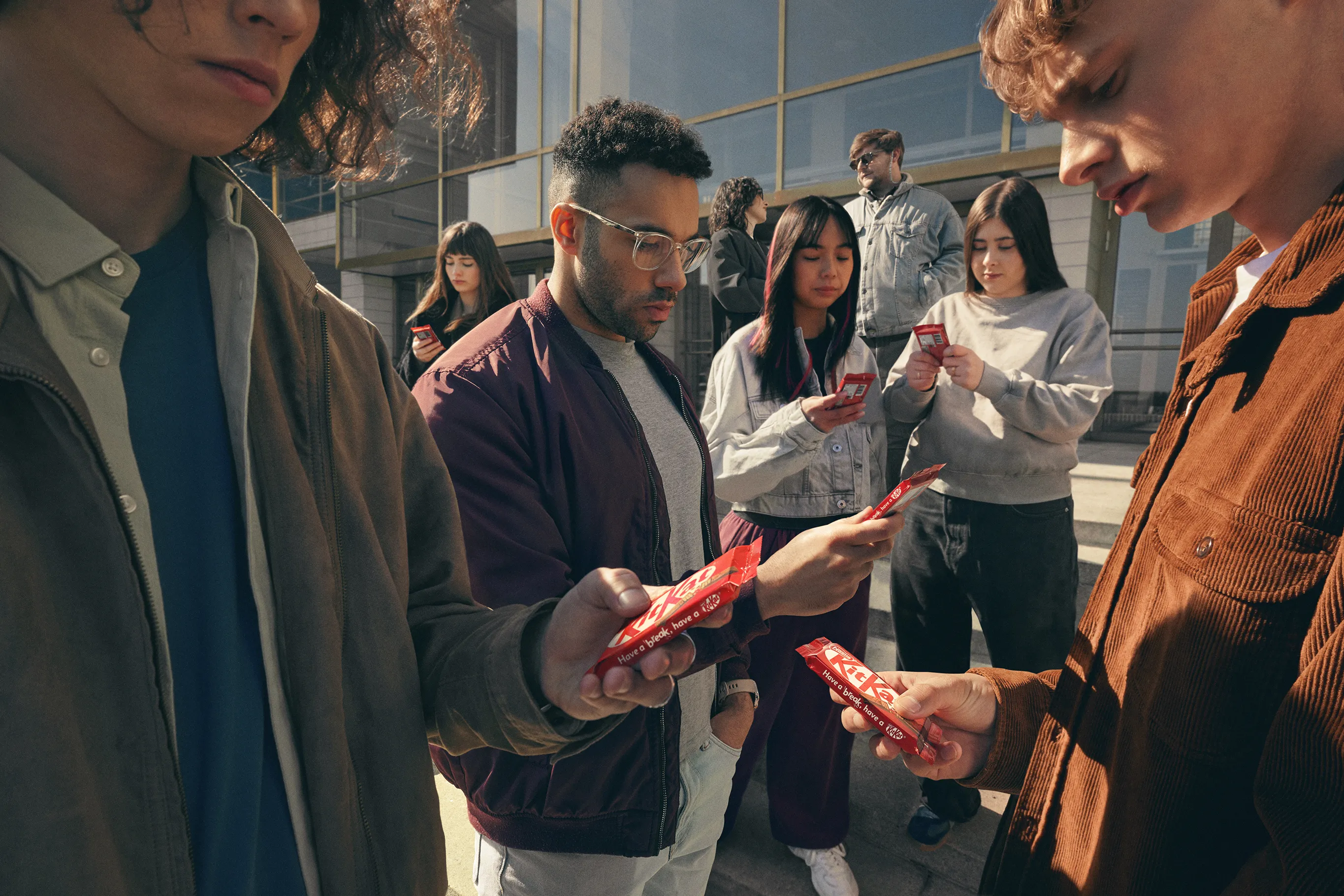
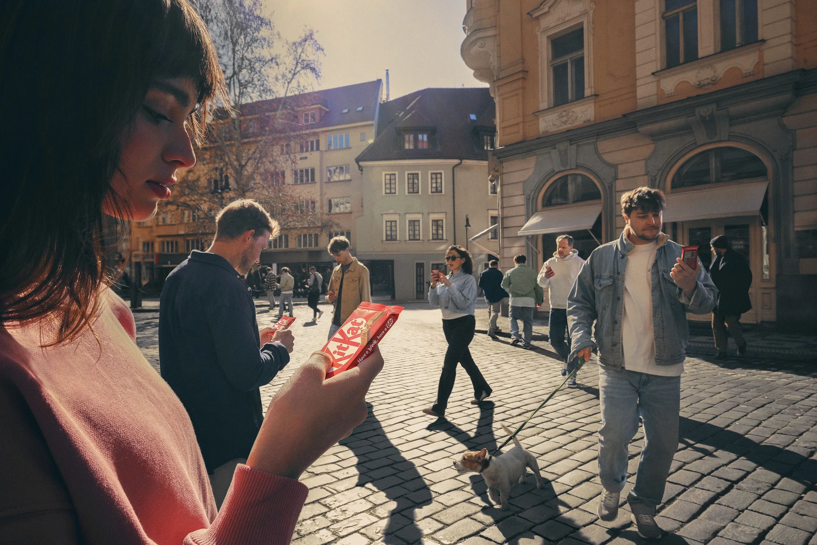
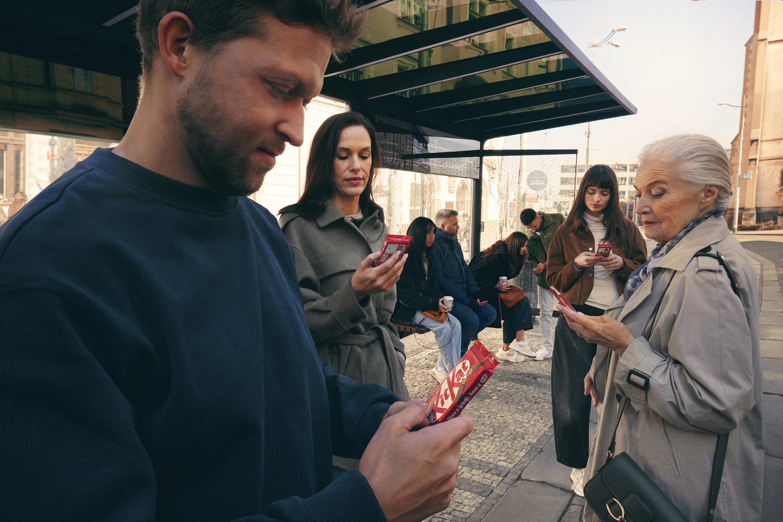
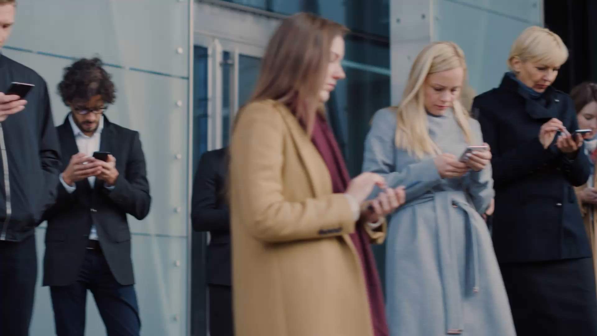
 KitKat Phone Break - Crowd...
 KitKat Phone Break - Street...
 KitKat Phone Break - Public Transport...
Entrant Company
VML Czechia
Entry Type
Product/Service
Launch Country
Czechia
Program
Clio Awards 2026
Medium Type
Professional
Medium
Print & Out of Home Craft
Category
Art Direction
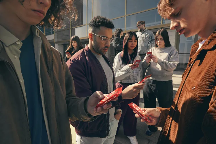
For over 65 years, "Have a Break, Have a KitKat" has been woven into pop culture. But for Gen Z, breaks have become just another form of screen time. KitKat's Phone Break campaign used art direction to reflect that reality back - without saying a word.
The approach was pure visual storytelling. We photographed everyday public moments (commuters waiting, pedestrians scrolling, friends together but distracted) and made one subtle swap: replaced their phones with KitKats. Same grip. Same posture. Same natural lighting and authentic styling. The images mirrored real life so closely they felt documentary.
Then came the art direction discipline: no logo, no headline, no call to action. Just the image. The product had to deliver the entire message on its own - a decision only possible because of 65 years of brand consistency.
Each execution was site-specific, art directed to echo its exact location. Posters at tram stops showed people at tram stops. The result? Passersby scrolling on their phones unknowingly mirrored the same pose as the images beside them. The recognition came not from exaggeration, but from perfect, quiet observation.
The campaign earned global coverage (Muse by Clio, Adweek, Campaign Brief, LBB) reaching 2.63 million online. Industry leaders called it "a masterclass in marketing" and "the best example of the power of a 65-year-old tagline in action." It proved that sometimes the smartest art direction is the kind that disappears, leaving only the idea behind.
Executions
KitKat Phone Break - Crowd
Art Direction
KitKat Phone Break - Street
Art Direction
KitKat Phone Break - Public Transport
Art Direction
Credits
Creative Agency
VML Czechia
Prague 7
Media Agency
Mindshare
Prague 7
Creative Agency
VML Czechia
Prague 7
Agency Network
VML
Kansas City
Holding Company
WPP
London
Production Company
Pavleye Artist Management And Production, s.r.o.
Prague
Chief Creative Officer
Jake Barrow
VML Czechia
Chief Executive Officer
Iva Welker
VML Czechia
Creative Director
Karla Calheiros
VML Czechia
Global Chief Creative Officer
Debbi Vandeven
VML
Global Chief Creative Officer
Rafa Pitanguy
VML
Chief Creative Officer
Jaime Mandelbaum
VML
Global Chief Creative Officer
Bas Korsten
VML EMEA
Account Director
Radim Stuchlik
VML Czechia
Copywriter
Johnny Gaponenko
Motion Designer
Arina Varenova
VML Czechia
Motion Designer
Soumik Babuya
VML Czechia
Account Manager
Aneta Jungvirt
VML Czechia
Creative Director
Wanslez Quaresma
VML Czechia
Photographer
Miro Minarovych
Pavleye Artist Management And Production, s.r.o.
Art Director
Carlos Paboudjian
VML Czechia
Executive Creative Director
Mauro Fardin
Copywriter
Helena Johnston
VML Czechia
Duplicate statues available now
Buy a Statue in
Print & Out of Home Craft
to Celebrate Your Team

Related Winners

Entrant Company
BETC
Medium Type
Professional
Medium
Media
Category
Out of Home
Launch Country
France
Entrant Company
BBH
Medium Type
Professional
Medium
Out of Home
Category
Billboard
Launch Country
United Kingdom

Entrant Company
BBH
Medium Type
Professional
Medium
Creative Disruption
Category
Film
Launch Country
United Kingdom

Clio Awards
by Luz Corona
by Luz Corona
Ad of the Week
by David Gianatasio
by David Gianatasio

2 Minutes With
by Luz Corona
by Luz Corona